



Description
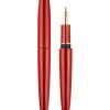
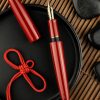
PIUMA HANE Aka
There are some colors that reveal themselves immediately, in all their intensity. Others hold a more subtle depth—a secret that only light can unveil.
Red is one of these.
In Japanese tradition, red has a very ancient history. As far back as the Jōmon period, red lacquer was used to coat objects that were also believed to possess symbolic value. Associated with fire, the sun, and life, this color held a meaning that went far beyond its beauty.
A profound connection between color, nature, and material—one that spans the centuries and continues to live on in the art of Urushi.
From this inspiration comes PIUMA HANE Aka, the fifth creation in the HANE family, following HANE #1, HANE Kuro, HANE Toruko and HANE Murakumo. A new chapter in the dialogue between SCRIBO and the ancient Japanese art of lacquerwork, in which red becomes an expression of depth, materiality, and light.
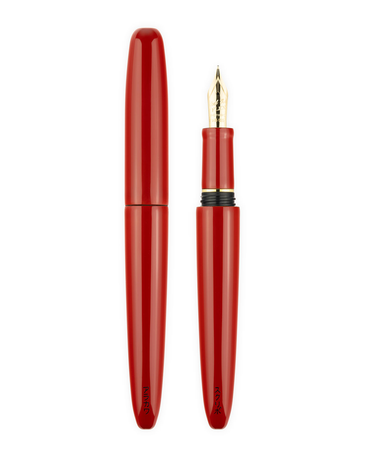
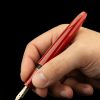
The word “Aka” in Japanese refers precisely to the color “red.” An essential name that encapsulates the character of this fountain pen: an intense, vibrant red whose luminosity seems to emanate from inside.
In Japan, red is not merely a color. It is a presence.
It is the vermilion red of the torii gates that mark the entrance to the sacred site – a threshold between the everyday world and the spiritual realm. It is the color that protects, that wards off darkness, and that guides people as they cross into a new space.
In Japanese culture, red color carries deeply positive meanings associated with good luck, prosperity, happiness, and rebirth.
But Japanese red also has a more intimate dimension. It is the color of emotion, love, and courage. It is a color that does not ask to be seen – it asks to be felt.
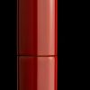
In the tradition of Urushi lacquerwork, red takes on an entirely different depth. Thin layers of natural lacquer are applied by hand, one after another, with patient and precise strokes, giving rise to an intense, glossy, and vibrant red. Layered, worked, and nourished by time, the lacquer becomes a surface capable of capturing light and slowly reflecting it back. It is no longer simply color: it is matter, memory, and gesture.
Nothing happens instantly. Each layer requires patience; each step, attention. On the surface, the reflections reveal the dedication of those who have worked the material, respecting its own rhythm, with the sensitivity and care characteristic of the artisan’s craft.
Thus, the color red becomes a metaphor for writing itself.
Every word is a small step.
Every gesture leaves a trace.
Every page is a threshold to cross.
And red, like a thread that unites matter and spirit, accompanies that gesture, reminding us that writing means, first and foremost, giving shape to life.
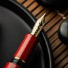
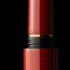
The yellow gold accents add another dimension of luminosity. The gold SCRIBO nib and the section ring, with its matching finish, complement the fountain pen’s lines and highlight its elegance. The warmth of the metal thus meets the depth of the lacquer, creating a balance in which every detail contributes to the overall harmony.
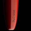
The signatures of the artist and SCRIBO, both written in katakana characters, add a subtle touch: the mark of a hand, a testament to the craftsmanship embodied in every creation.
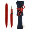
The fusion of these two traditions continues in the pouch that accompanies the PIUMA HANE Aka. Handcrafted and hand-sewn with authentic Japanese kimono silks, it carries with it another story of materials and craftsmanship. Even the act of storing the fountain pen thus becomes part of its beauty.
In the PIUMA HANE Aka, Italian artisanal sensibility meets the Japanese tradition of Urushi. Two cultures, two ways of working with materials, united by the desire to create something that will stand the test of time and continue to inspire.
The fountain pen thus becomes more than just a writing instrument: an invitation to observe the details, to rediscover the pleasure of a personal gesture through contact with the paper.
Some beauties do not reveal themselves at first glance. They allow themselves to be discovered, day after day.